
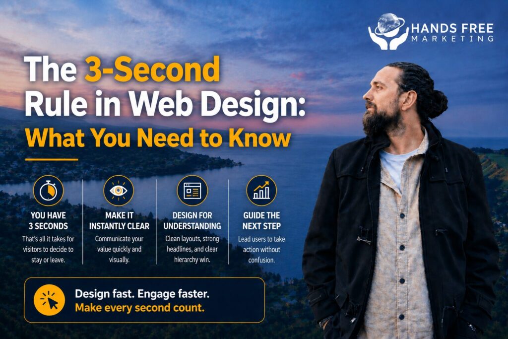
Your website has only a few seconds to make a strong first impression. If visitors can’t quickly understand who you are, what you offer, or how to take the next step, they’re likely to leave and visit a competitor instead.
That’s why the 3-Second Rule in Web Design is so important. It focuses on creating a website that immediately captures attention, communicates value, and encourages users to stay.
What Is the 3-Second Rule in Web Design?
The idea is simple: within the first three seconds of landing on your website, visitors should be able to answer these questions:
- What does this business do?
- Is this relevant to me?
- What should I do next?
If your website doesn’t provide clear answers quickly, you risk losing potential customers before they even explore your services.
Make Your Message Clear
Your homepage should instantly communicate your value.
A strong headline, a short supporting message, and a clear call to action help visitors understand exactly what your business offers. Avoid vague slogans that don’t explain your products or services.
Keep the Design Simple
A cluttered website can overwhelm visitors and distract them from taking action.
Instead, focus on:
- Clean layouts
- Easy-to-read text
- Consistent branding
- Plenty of white space
- Clear navigation
A simple design helps users find what they’re looking for faster.
Optimise for Speed
Even the best-looking website won’t perform well if it loads slowly.
Fast-loading pages improve the user experience and reduce the likelihood of visitors leaving before the page has fully loaded. Compressing images, minimising unnecessary scripts, and choosing reliable hosting all contribute to better performance.
Prioritise Mobile Users
Many people browse websites on their smartphones.
Your website should automatically adapt to different screen sizes while keeping text readable, buttons easy to tap, and navigation straightforward. A mobile-friendly experience helps visitors stay engaged regardless of the device they’re using.
Guide Visitors to Take Action
Every page should have a clear purpose.
Whether you want visitors to request a quote, book a consultation, or contact your business, your call to action should stand out and be easy to find.
Avoid giving users too many options. Simplicity often leads to better conversion rates.
Why the First Few Seconds Matter
Visitors form opinions about a website almost immediately. A professional, fast, and easy-to-use website builds trust and encourages users to continue exploring your business.
When your website creates a positive first impression, you’re more likely to generate enquiries, sales, and long-term customers.
Build a Website That Converts
Following the 3-Second Rule in Web Design isn’t about making your website flashy—it’s about making it effective. Clear messaging, fast performance, and intuitive design work together to create a better experience for your visitors.
At Hands Free Marketing, we design websites for businesses across New Zealand that not only look professional but also help turn visitors into customers through thoughtful, conversion-focused design.
If you want clarity instead of guesswork, get in touch.
👉 Book your free 15-minute consult
📞 027 590 9421
📧 jevon@handsfreemarketing.com
🌐 Web Design Hawke’s Bay